Hear ye! Hear ye! I call all eligible voters to please do their civic duty and vote this upcoming election, and then come to this made-up watch party that should totally be a thing.
This week in my Visual Rhetoric class, we have been discussing one of the basic principles of design, proximity. A simplified definition of this term is “items relating to each other should be grouped together” (Williams 13). Basically, this means that when alike items are grouped together, it is easier for a reader to grab ahold of what you are trying to say. Plus, proximity makes the ad, poster, flyer, brochure, etc. easier on the eyes, which is always important.
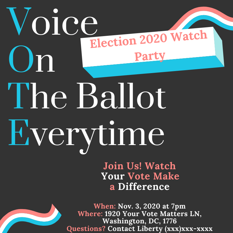
To test our knowledge of this concept, my classmates and I were assigned a project. This project consisted of us designing our own social media ad using the principle of proximity for an upcoming (make-believe) event of our creation that was influenced by a passion of ours. Well, if it wasn’t obvious in my ad, I have a passion for politics. When trying to decipher what event I wanted to promote, it was easy to think about the election because of course, that is all we hear about nowadays.
I chose to promote an election party over just voting because I wanted to have a specific event to promote. When I began designing my ad I had a few specifics in mind; I wanted the colors red, white, and blue, and I wanted it to be simple but sophisticated.
When first looking at this ad, your eyes should look immediately at the white box that contains the words “Election 2020 Watch Party.” If they do, then I did my job right. This group of words is restrained within the barriers of that white box because they create my “title” or what the event is. The white box “pops” from the dark-colored background, emphasizing its importance and its desire to be seen first.
Next, the goal was for your eyes to read the word “VOTE.” This was meant to emphasize the whole point of why we even hold elections while also giving a reason to what this party is about. We can’t have the party without voting, now can we? The acronym of “Voice on The ballot Everytime” emphasizes the voice each citizen holds. The blue and white letters are in close proximity to each other because even though they are two different colors, they are meant to be read all together after looking at the word “vote.” There is no extra space between the blue letters and the white letters because the acronym would not have read as smoothly then.
Towards the bottom of the ad is where all of the information necessary to attend this event can be found. The sentences “Join Us! Watch Your Vote Make a Difference” is grouped together because they should be read with one joint meaning: that each of our voices holds an important part of the election, and this power should be watched together. The information grouped together at the very bottom is seen as one because it is alike information. It is below where it says “Join Us!…” because this information tells you how you can join us. The use of both red and white words in these two groupings is to provide emphasis on the important words that are used to show emphasis and what should be read first.
A lovely element of white space, or in this case gray space, is a valuable element of proximity. This allows for readers to not feel too overwhelmed while looking at the ad. Another way for readers to not feel too overwhelmed is to simplify the number of different fonts and colors that are used. There should only be 3-5 different elements that a reader has to look cipher through. This ad has three colors that are easily readable off of the gray background, and there are only two different fonts used, just at different sizes.
When looking at the rhetorical situation, the purpose of this ad is to promote this election watch party for 2020 to an array of voters on social media. While promoting this event, it is also showing the importance of voting and the voice we each have. Hopefully, this purpose comes through, you enjoyed looking at it, and you even caught the little easter eggs I threw in about America and voting.
Now, I must leave you with a quote from the wise Leslie Knope,
It’s not a movie, it’s our real life.“
(Brinlee)
Thank you for reading! – Samantha Belle
Works Cited
Brinlee, Morgan. “15 Times Leslie Knope Totally Nailed 2017 Politics.” Bustle, Bustle, 26 Feb. 2017, http://www.bustle.com/p/15-leslie-knope-quotes-that-are-startlingly-relevant-to-politics-in-2017-40555.
Williams, Robin. The Non-Designers Design & Type Books: Design and Typographic Principles for the Visual Novice. Peachpit Press, 2008.

Samantha,
I really appreciate your in-depth analysis and detailed descriptions of how the lessons we learned concerning proximity apply to your social media ad. I now have a clear understanding of each decision you made in your design. You were clearly intentional with the purpose of every element you included. The layout of the acronym, the font sizes, the various font colors, and the white space all meshed together well, and I was able to follow the progression of information just as you intended. The most significant pieces of information were emphasized accordingly, and the overall aesthetic of the design was visually pleasing as well. Nice job.
LikeLike