After another week of trials (impeachment) and stress-induced headaches (Harry and Meghan probably have one), I have once-again learned something new in my Visual Rhetoric class. This week I have learned how to align with a purpose.
As was prescribed in my assignment for this week, I have created a fictional app that would be beneficial to GWU’s campus life. We were supposed to create three wireframes for this app. What are wireframes, you may ask? They are the skeleton behind the layout of the app’s pages.
Before I show you my wireframes, I’m going to tell you a little bit about the premise of my idea. My app is a singular place for GWU students to find information about different academic support opportunities around campus. It will also be a place for students to quickly make appointments with these services as well. Students can currently make appointments on WebbConnect, our school’s server, but this would be a more accessible tool for students to use.
I have a direct interest in this app concept because I am currently a Writing Center consultant. Over my 1 ½ years of working this job, there have been multiple instances where students have made appointments with me, thinking it is for different academic support services like Peer Tutoring. This app is meant to delete this confusion by allowing easy access for students to look at descriptions for each of the services, the times they are open, who’s working there, etc.
I think that is enough backstory for now, so if you will please keep scrolling, you will FINALLY see the wireframes I created. (P.S. I am under strict policy to not apologize for things I can’t fix, but I just want to warn you that the pictures may seem a little fuzzy. If they do, blame Gliffy)
TA-DA! Welcome to an inside look into my new app, GWU: Ignite Your Intelligence. Now for a little explanation for each wireframe so you know why I made the choices I did:
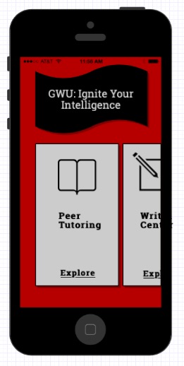
The first wireframe is the lovely homepage. If you’re wondering, even though it has nothing to do with alignment, the color scheme is red, black, and light gray because…GO BULLDOGS. Anyways, let’s start at the top of the screen (not counting the AT&T, battery power, etc. bar). The app title is written within the black, curved shape that is in the center of the top third of the screen. I chose to place it there because it has obvious emphasis, making it clear that it is the title. There is a movement within the shape that helps make the app seem “bigger” than it is. Also, there is a direct path of eyesight movement down to the light gray boxes that consist of the different academic support services.
Each rectangle is about half of the screen, but it is moved up from touching the bottom of the screen to show that the rectangles can be moved. What I mean by “moved” is that the student can swipe left to get to the next service. I thought this would provide a nice movement on the page. Also, the light gray boxes are buttons. The rectangles are basic so they can be easily read. The icons of the book and the pencil and paper are larger than the words, but not by too much. However, the icons and “Explore” are centered while the words “Peer Tutoring” and “Writing Center” are flushed left. This is because I wanted to provide an interesting contrast with the titles of the services from the other elements on the rectangles.
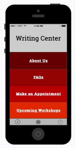
The second wireframe shows what the screen would look like if the student was to click on the “Writing Center” button. This screen is blockier than the homepage because there is a lot to choose from. The buttons are boxes because that is simple and there is an obvious contrast with the different choices a student could make. All of the words are centered because it made for a “clean” look, which I enjoyed. At the bottom of the screen are three little icons: the one on the left is a back arrow, the one in the middle is the “home” button, and the one on the right is the “make an appointment” button that is signified by a clock (because I couldn’t find anything better). I thought this would be a nice option because, at any point, the student can make an appointment with one of the services. All of the icons are aligned and the far-left and far-right ones are aligned with the “W” and the last “r” in the “Writing Center.” This provides the barrier that everything is within.
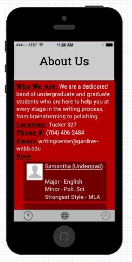
The third and last wireframe shows what the screen would look like if the student was to click on the button “About Us.” The “About Us” is centered because it is the title, but it also starts the reading path. As the student views this screen, they can read from “About Us” and then follow down to read the different headings in black. The “Bios” section is intentionally different because I wanted to provide another way the students can actively scroll on the screen and did not have to click on another button. The boxes are centered to show that the student must scroll down to continue reading the bios of the glorious writing center consultants. The words in the bio boxes, however, are flushed left and even with the first letter of the consultant’s name. Lastly, the icons appear at the bottom of the screen again for the same purpose.
Well, that’s it, folks, for this week anyway. I hope you will leave this blog post with a new sense of what it means to be “aligned,” or at least how to align a poster, social media post, etc. to where it is intentional and effective.
Lots of love,
Samantha Belle
Works Cited
Williams, Robin. The Non-Designers Design & Type Books: Design and Typographic Principles for the Visual Novice. Peachpit Press, 2008.

Samantha,
I almost made a Writing Center app too, but I’m glad I didn’t. Yours looks really awesome! I like how you were able to include all aspects of GWU’s academic support. The option to swipe left for more tabs is a neat idea that I never would have thought of. Your flush left alignment vs. centered looks really nice. I’m still trying to break my habit of aligning centered haha.
Even though we’re not on color yet, I like your use of different shades of red for the second frame. Also, love the part of the WC bios on the third frame. This whole idea is great because, as we’ve talked about, the GWU website is the only place to find our bios. Students are more likely to use this app. I think you’ve done a great job capturing the purpose and audience for this post.
LikeLike
“P.S. I am under strict policy to not apologize for things I can’t fix, but I just want to warn you that the pictures may seem a little fuzzy. If they do, blame Gliffy)” (nods!) We’re learning.
LikeLike