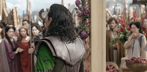
Hellooo fellow Asgardians! I sincerely thank you for visiting my blog today, for I have important information that you must hear. Have you ever heard of the Great Loki of Asgard? If not, that is a disgrace and you must die. Okay, just kidding. But seriously, the beautiful man making an appearance at the beginning of this blog, that’s Loki and man could he be of great service to you.
Below, I have Loki’s business cards. Please, take a look and feel free to call him because Avengers: Age of Ultron never happened.


You may be asking yourself why I decided to create business cards for this devious character. Well, besides the fact that he’s amazing, it is for a school project. In class this past week, we have continued our discussion of CRAP (Contrast Repetition Alignment Proximity) with our new knowledge of color!
“Color” is such a simple word with a lot of weight.
There is so much more to know about color that is beyond primary colors and that there are 7 different colors in the rainbow. In Robin Williams’ design book, The Non-Designer’s Design Book (4th edition), I learned various new terms and design principles that deal with color; such as triad, analogous, CMYK, and RGB.
Our task for this week was to create a set of 3 business cards for a fictional character. Each business card was to keep the same design but have different color schemes. Before I get into the details of my color choices, I will give you a brief explanation for my design choices. First of all, and most importantly, this design would not have been possible without the brilliant work of the one and only, Sophie Simmons (my best friend’s sister). She is a giant marvel fan and genius artist, who so willingly allowed for me to use this Loki helmet she designed.
It pained me that I chose to put only the right half of the helmet on my card, but I really liked the look of it. This design element makes the card look more open and not as compact. This was one of the reasons the business cards are vertical. The other reason being that I thought the card would feel more “Loki” if the viewer could see all of the horn since that is a staple of his attire. The words chosen explain Loki to a “t” and the quote is from the first Avengers movie, where Lokie makes his first appearance. The helmet serves as a frame for the words as both of the first letters of “Asgardians” and “Call” touch the edge of the helmet. The curve of the words was also created by rotating “flushed left,” “flushed right,” and “center” between the groups of words.
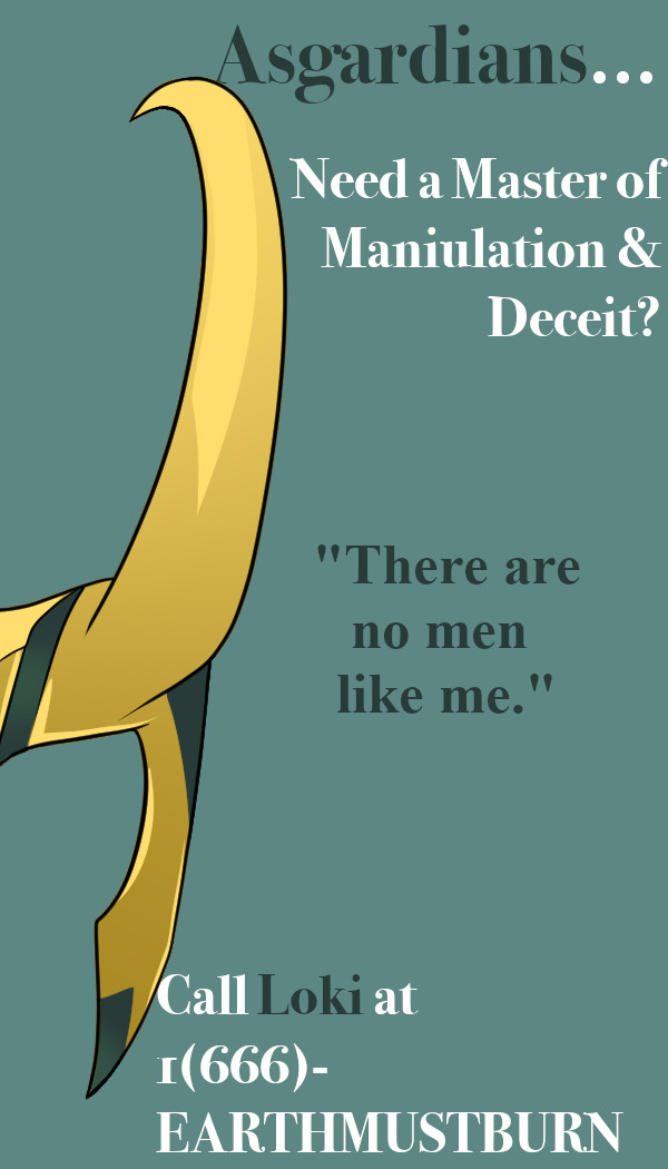 Here is the first color scheme I used on this card. With the help of Adobe Color Wheel and the “color picker tool” from Gimp, I was able to take the green color from the helmet, put it into the color wheel, and the website pulled up different colors that correlate with it. The first “Color Harmony Rule” (according to the website) I chose was monochromatic. This means that the colors are tints and shades from the one hue chosen, the green color from the helmet. The colors created were teal like, so I chose the lightest one on the right (out of the 5 given) to be the background. Then I chose the second darkest color (besides the hue) to use for my “accent” words. I wanted these words to “pop” which is why I chose a darker color. Both of the colors chosen are “cool” colors, meaning they recede into the background, but since the one that is darker is in high contrast with the white and the background, it still “pops!”
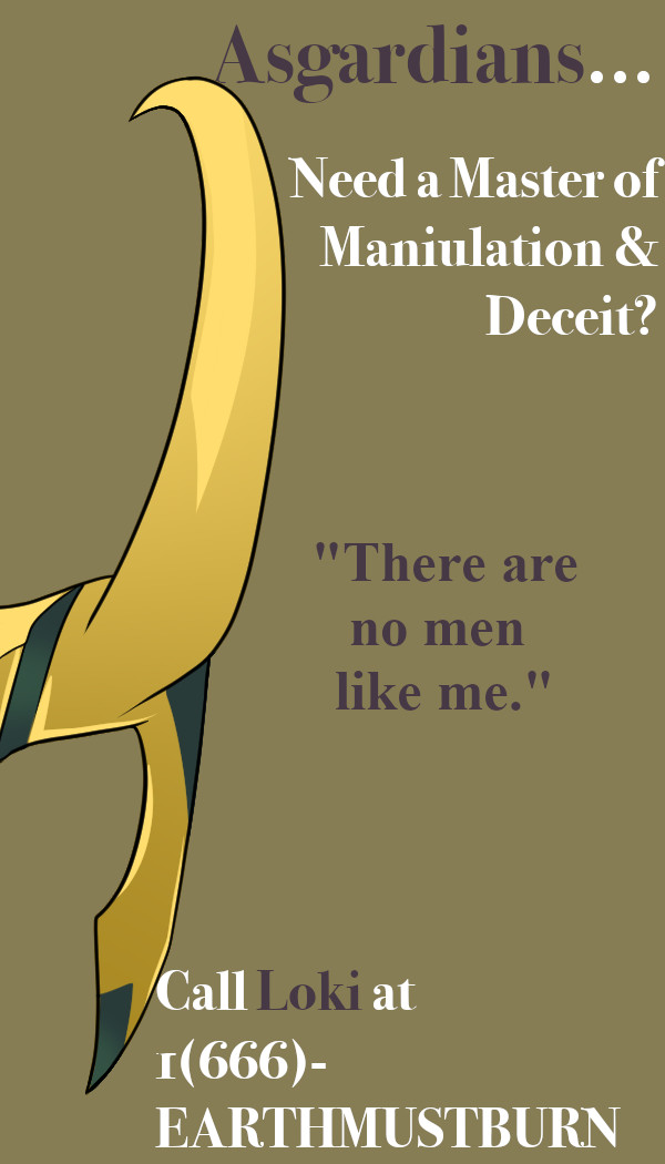 The second color scheme I chose is a part of a triad color scheme. Again, I chose the green from the helmet to be the hue that the other colors are based on. A “triad” is a set of 3 colors that are in equal distance from each other on the color wheel. In this case, much to my enjoyment, one of the colors is the nice tan color set as the background. This made me happy because tan is an interesting color to use as a background besides white and black. The maroon color chosen for the accent words also comes from the triad, just on the opposite side. This was a similar mindset as the card before, where there was a lighter background, so the darker words, even though maroon is a “cool” color, it still “pops!”
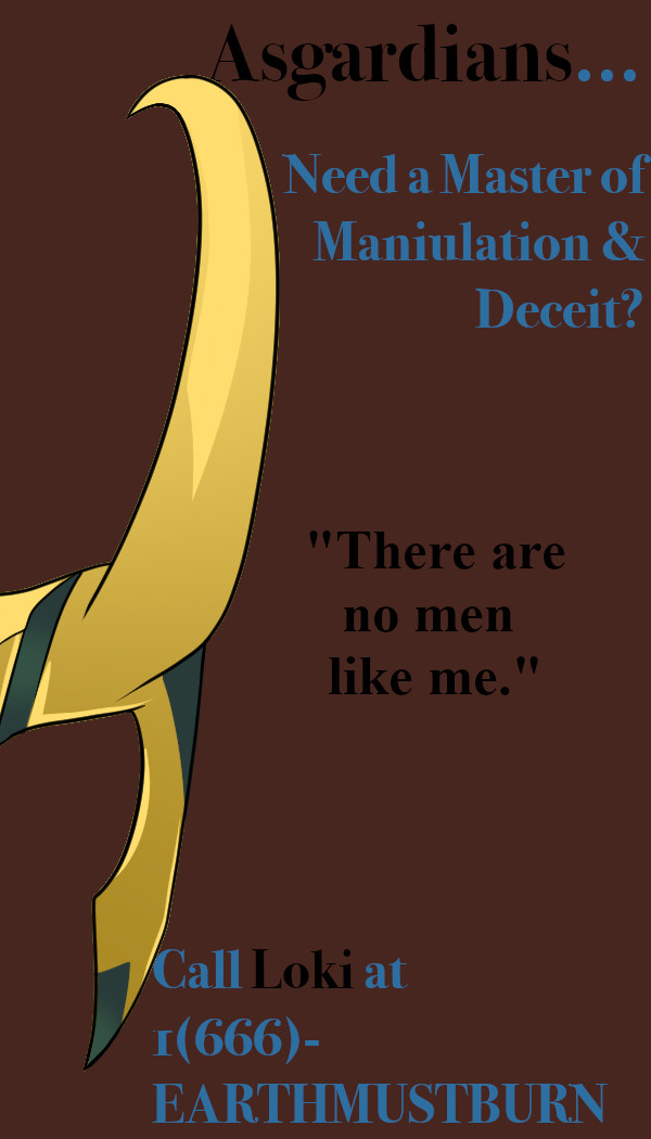 The third and last card, and personally my favorite, is a split complementary color scheme, or “compound” as it is said on Adobe Color. This means that the colors used are the ones right beside the complement (direct opposite) of the hue (again, the green from the helmet). This one is my favorite because it is not a color scheme I anticipated I would use. I chose the dark maroon background first because the other two cards have light backgrounds. Then I found that the blue worked really well for the accent words. Lastly, rather than keeping the other, non-accent words as white, I chose to make them black. This provided a great contrast that I didn’t know I needed.
Well, I don’t want to bore you anymore with the little details of why I chose to do what I did, but do know that I had a BLAST while doing it. Also, it totally put me in the mood to go watch every scene of every movie that Loki is in and impatiently wait for his new Disney + tv show.
Thank you and good night.
Samantha Belle
Works Cited
“Adobe Color Wheel.” Adobe, https://color.adobe.com/create
SOPHIE SIMMONS
“Tom Hiddleston Smile GIF.” GIFY, https://giphy.com/gifs/reaction-8PsbM0OpqPl9OClfSw
Williams, Robin. The Non-Designers Design & Type Books: Design and Typographic Principles for the Visual Novice. Peachpit Press, 2008.

You are officially the first person I’ve met who is such a Loki fan. Who knew? As his agent, you should just be warned that he is not to be trusted. : )
LikeLike
Samantha,
Loki is a despicably charming character, and I think it’s awesome you chose him. I love how his card unabashedly states his strengths; you’ve encapsulated his personality well. The helmet is a perfect symbol to represent him without needing to place his face on the card. This also adds to his deceitful ethos, as one does not know what form he will appear in. I also enjoy the last color scheme the best. The helmet and text really pop off the page, and the compound color combo you chose provides a uniquely Nordic undertone through earthy tones. Great job!
LikeLike