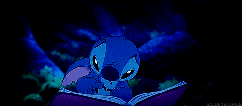
If you’ve seen the wonderful movie, Lilo & Stitch, then you know that the above picture is one of the saddest parts of any Disney movie. Stitch finds the book The Ugly Duckling, realizing he is like the ugly duckling (cue the waterworks). The reason I am reminding you of this sadness is that for my next visual rhetoric project I decided to be like Stitch and read the story, The Ugly Duckling.
This week’s project challenged us to recreate three scenes from a fable/fairy tale through shapes and colors. This exercise comes from the phenomenal book Picture This! How Pictures Work by Molly Bang. In this book, Bang reimagines the story The Little Red Riding Hood through shapes and colors, teaching the reader different shapes and color principles. Using what I have learned from her book and from Robin Williams’ book The Non-Designer’s Design Book, I tried to design three important scenes from Hans Christian Andersen’s Ugly Duckling tale.
The first scene I recreated was when the Ugly Duckling first hatches. After hatching, he is immediately labeled as ugly and different from his siblings. Here is my first design:
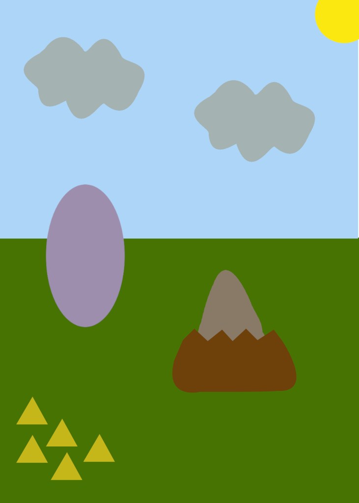
First, a little explanation of who is who and why they are the way they are might be helpful. The light brown, rounded triangle is the Ugly Duckling, hatching from his brown egg. He is light brown because he is different than his yellow siblings (the yellow triangles) and brown is not that attractive of a color. Also, brown is considered a warm color so he “pops” on the green background (the grass). He is a rounded triangle shape and larger than his siblings because I wanted to show that he is different but similar to his siblings. His siblings are intentionally pointy triangles because they are mean to the Ugly Duckling, so they do not deserve to be rounded and approachable, as Bang would say. This is opposite from both the Ugly Duckling and the Mama Duck (the light purple oval) because they are supposed to be huggable and provoke sympathy. Mama Duck is light purple because that is a nice, cool color that falls into the background to bring more focus on the other ducks. The Mama Duck and the siblings are to the left of the Ugly Duckling and in the same panel to show proximity by grouping them together. The purpose of the siblings and the Mama Duck being distant from him is to show their common uneasiness with his appearance.
The second scene is of the Ugly Duckling flying away from his family in the pouring rain. He does this because of how lonely he feels with everyone making fun of him and calling him a mistake and not a real duck. Here is my second design:
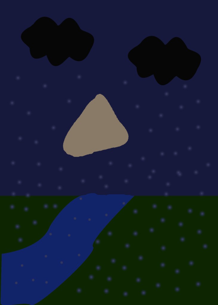
The color and shape of the Ugly Duckling are repeated (even though the brown looks different with the dark blue background, I promise it’s the same) to show consistency. He is the only character in this scene to show how alone is felt and provoke sympathy. His head (the tip of the triangle) is tipped downward to represent him sadly and shamefully dropping his head. The sky is now a dark blue to show that is now a darker point in the story, and the same goes for the dark green color of the ground. There is now a river going through the ground to emphasize that the Ugly Duckling is flying through the sky. There are raindrops and dark clouds to represent the storm he is flying through and feeling on the inside. He is intentionally seen heading toward the other side of the river because he is trying to get to a better life where he’s accepted.
The last scene is of the Ugly Duckling a year later, now as a beautiful swan flying away from his family towards his newly found family of other swans who accept him for who he is. Here is my last design:
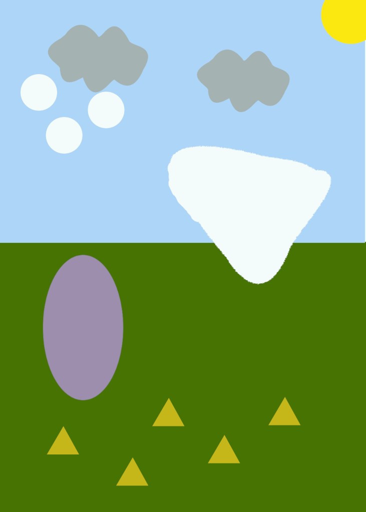
The shape of the Ugly Duckling is repeated to show consistency, but he is now white. This is because he is now a beautiful, perfect, white swan. He matches the other three swans in the sky who are represented with circles because they are welcoming to the Ugly Duckling. The Ugly Duckling can be seen flying away from his family because his head is in the direction of the swans who are smaller and seem farther away. There is the repetition of the Mama Duck and the siblings because they are still watching but with awe rather than disgust. This scene shows how the story goes full circle by having a lot of the same elements as the first scene but subtle, important differences that can be easily seen.
Even though this project was difficult and completely out of my comfort zone, I have truly enjoyed it. This is such an important story and I am glad I could retell it in this way. Remember, even though someone is different than you, it does not make them inferior.
Works Cited
Bang, Molly. Picture This! How Pictures Work. Chronicle Books, 2016.
Wiffles. Stitch and The Ugly Duckling. WaffleGifs.
Williams, Robin. The Non-Designers Design & Type Books: Design and Typographic Principles for the Visual Novice. Peachpit Press, 2008.

Samantha,
I really loved reading your blog! The Lilo and Stitch was a perfect touch to your story. I liked that you and I both wrote the story line, and then explained it. Your color layout is very pleasing to the eye for all three slides, and you perform an excellent job in demonstrating repetition of characters throughout from your shapes. I liked how you explained the Ugly Duck’s head being down when he was flying away, adding that extra detail to communicate the story. I loved your touch of proximity in the first slide, I did not realize I had connected the triangles (ducklings) with the mother duck until you mentioned they were in the same region of the image. Your alignment is well done as well by always keeping the Ugly Duckling (and swan) separate from every character to show the story revolves around him and to show his relations to others. I really loved the shape of your clouds, they seemed so perfect. Is there a significance that the clouds are gray in your last picture? I was just curious! Nice conclusion, I completely agree.
LikeLike