There’s a lot that can be said in a word, right? I mean, in a word, you have letters that “come together” to build a word that has a definition. But, as I have learned this week in my visual rhetoric class, there is so much more to the world of words, and in today’s world words begin with typefaces.
As our readings of The Non-Designer’s Design Book by Robin Williams came to a close, we looked in depth at one more element of design: type. I have grown up in a technology-centric world were Microsoft Word and its pre-downloaded fonts were all I ever knew, until this class (we don’t even use the term “fonts” anymore, we say “typefaces”). There is so much that needs to be said (literally), so it’s important to know exactly how to do it, which is what we’ve been learning all about.
I would love to teach you some of the interesting facts about type that I have learned, so I will first show you the design I created for this week’s challenge. Below, you will find the word I created on Gimp and how I designed it to illuminate the definition of the word while also provoking a certain pathos from the audience.
Here is my chosen word:

I am not sure why I just randomly thought of this word one day this week, but once I did, I knew it just had to be the word I designed for this project. According to Lexico, “flamboyant” means “(of a person or their behavior) tending to attract attention because of their exuberance, confidence, and stylishness.” That whole definition makes me smile because it is so eccentric yet powerful. There is power in the unusual, which was my inspiration for this design.
This design was a long-time coming. The first idea I had, and the only one that stuck, was having the boy symbol representing the word “boy” and jumping. For this unique choice of symbol + word I used the concept of visual metonymy, which is when our brains cognitively associate the symbol with the word, so the picture of the boy is cognitively associated with the word “boy.” But what was I going to do with the other 7 letters? This is where I struggled. At first, I had all intentions to do something with 3D letters, but, after watching 4 different videos online and getting REALLY frustrated, I gave up and started pondering other ideas.
My route of thinking consisted of me knowing I wanted to have the letters be “bold” in some way, but not by using just the bold font style. This led me to ponder the idea of outlining the letters. By outlining the letters I could show the boldness of the meaning of “flamboyant,” but not too seriously since it is a fun word after all. To contrast with the seriousness of the bold outlines, I decided to use fun, bright colors, to show the other part of the “flamboyant” definition. Finally, I was able to visualize aligning the words at a curve and not a straight line to provide some diversity and uniqueness.
I have reinserted my design here to provide an easy reference as I go into the final details of my design process:
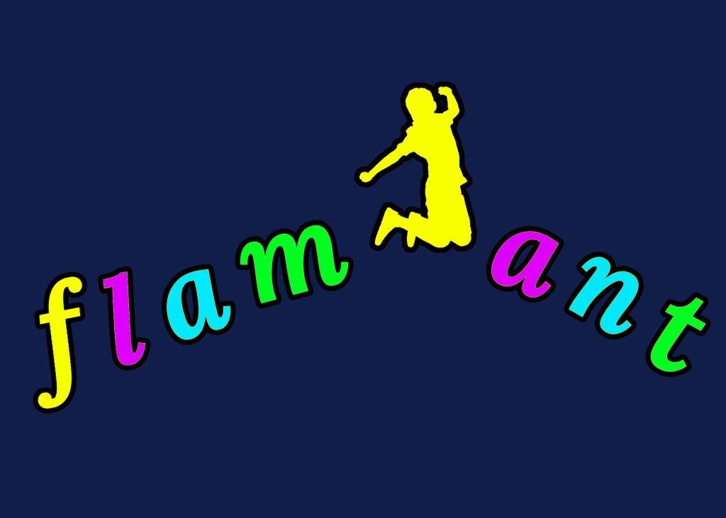
To begin with, the background is set as navy blue to provide a different color background than black (since that is the color of the outlines of the letters), but that still creates a dark base to contrast the word off of. I then had to decide on a typeface. I chose “Lora Bold Italic” because I fell in love with it when I first saw it in class and I liked what I could make it represent. Similar to my reasoning above the desire to show the serious or confident aspect of the definition while also showing the fun and eccentric side, I wanted the same for my typeface. Lora is a Slab Serif font, meaning the letters have “feet” to them (this whole post is written in Lora so you can use these letters for reference). This type of font is a modern font used at first for advertising and children’s books. This was because it has a straightforward look that is thick and distinguishable. By making the font in bold and italics there was the emphasis on “thickness” as well as a fun element with the end of the letters curving out more than being straight feet. I continued this notion of it being serious but not “too” serious by starting the word with a lower case “f.” By doing this, the word felt less formal and more freeing.
Once the letters were created and the boy cut out, I was able to start laying them out. I tried to use the practices of kerning, adjusting the space between characters, to have each letter equally spread out from each other to create an easy, readable flow that would show the curve but not be too distracting for the reader. This was able to connect with the boy with the rest of the word as well. The “t” is closer to the side of the image than the “f” to show movement off of the page, especially since the boy is jumping in the direction as well. The colors chosen were intentionally very bright to show the brightness of the word and anyone who is “flamboyant,” which is another reason the boy is jumping, to show he is “flamboyant” too.
I hope you feel happy when looking at this word and that it makes you want to get up and jump because I sure do after creating it!
With love,
Samantha Belle
Works Cited
“Flamboyant: Definition of Flamboyant by Lexico.” Lexico Dictionaries | English, Lexico Dictionaries, http://www.lexico.com/en/definition/flamboyant.
Williams, Robin. The Non-Designers Design & Type Books: Design and Typographic Principles for the Visual Novice. Peachpit Press, 2008.

Samantha,
I love your choice of a word! It was so creative to think of “boy” being a symbol to illustrate the meaning and spelling of the word! I enjoyed your bright analogous colors too! The hues really show the energy in the definition of the word. I like that you chose the shaded blue hue instead of a black hue, the shaded blue hue still holds the energy and life of the word, yet still adds the consistency neutral background needed for so many colors. Black would have been too serious. White would have hurt the eyes with all the tinted hues. The shaded blue is a perfect contrast. Your kerning between the letters and the boy is great too! I love that the word is “jumping” with the boy too. Terrific job!
LikeLike
OK, truth. Did you really jump? This is a fun design!
LikeLike