Gardner-Webb University’s English department is one of a kind. I mean, what other departments would let 6 of their students design the department t-shirt for the next few years?
If you’ve read my previous blog posts, you will remember that I am in a visual rhetoric class. Throughout this semester, we have designed various masterpieces from book cover designs to fancy typography. For our final design task, we had to design two t-shirt designs for the English department. These designs will then be taken to the faculty to vote on the winner. My partner for this, Thomas, was a dream. Our noggins work excellently together, allowing us to bounce ideas off of each other to create two wonderful, abstract designs that we are both proud of.
Before you scroll down to admire our magnificent designs, note that each design could have the possibility of having the English department logo on the left side of the front of the shirt where a pocket can be typically found. We have provided these logos on the correct color t-shirt, but they will not be that size by any means.
Now to our designs:
First up, we have:
GWU English Department logo that would go on the front. 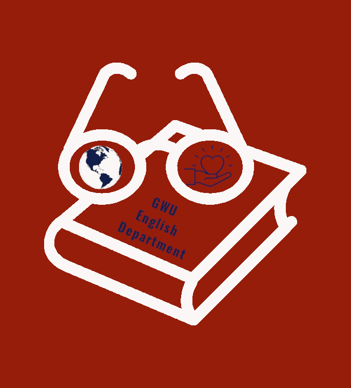
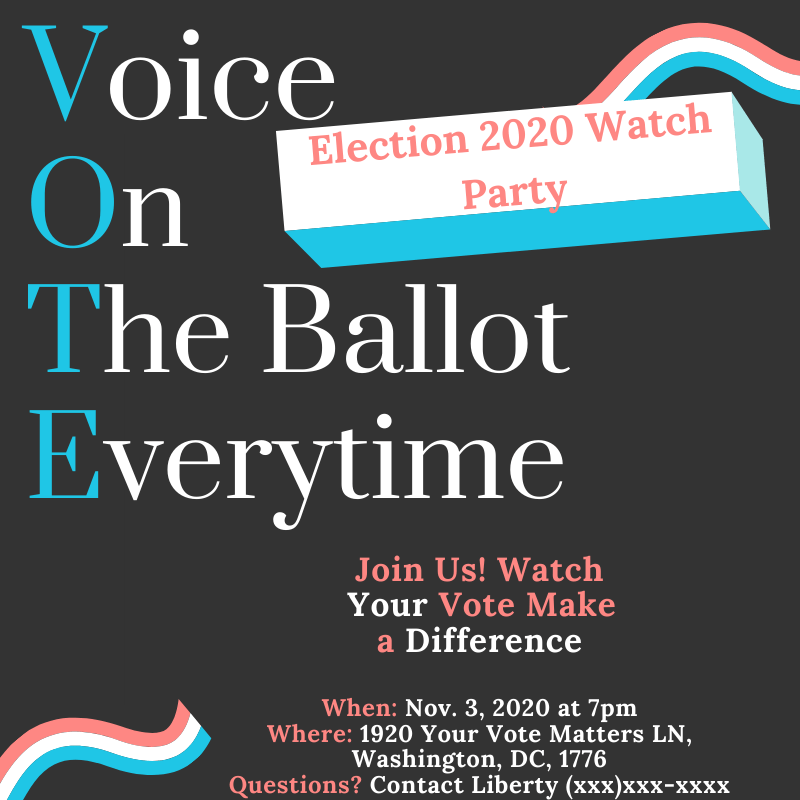
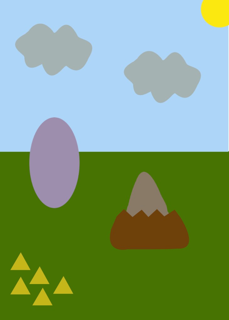
One of our t-shirt designs.
For this design, we kept to the task described by our professor to make it look “Englishy” but also like Gardner-Webb. To fulfill the “Englishy” aspect of that task, we chose a book with glasses. To us, this represents English very stereotypically. We know it’s basic for a book and glasses to represent English, but we wanted people to immediately acknowledge who we are representing. The glasses serve another purpose, they show our “nerdiness” while also showing our desire to look further than the bare eye can see. With the glasses, everything is focused. Also, in English studies, the term “lens” is often used to describe the way you are looking at something. The reason there is a globe in the first lens is that through the various courses a student can take at both the undergraduate and graduate level challenge students to see the world in a different light, or lens. Through reading and writing, we are able to take on the emotions and perspectives of various characters from various backgrounds, ethnicities, and challenges. This is a unique skill English students have that we wanted to showcase. In the lens on the right, you will find the symbol for empathy. By seeing other perspectives through reading and writing, students are also able to feel empathy at a stronger and more unique degree. Empathy is something that is not easily taught, but students are able to gradually hone in one this skill through these classes. Finally, to honor the Gardner-Webb aspect of the task, the shirt literally says “GWU English Department.” We are the authors of our own stories, and this is what is magnified through the texts read, analyzed, and written, but also through the wonderful examples the English professors have set for us.
The color of the shirt is the Gardner-Webb prescribed version of red (A712D1). The outline is white because we wanted it to pop the most. The words are the blue (151B48) found on Gardner-Webb’s branding guidelines as a complementary color. The words are in the font “Oswald” because it is a sans-serif typeface, making it easier to read and faster to comprehend.
Something our professor wanted us to be aware of when creating these designs is that we may only be able to print them in one color. For this design, our one color would be white. The only that that would be changed is that the globe would be transparent, outlined in white, and the contents filled in with white. Besides that, everything would stay the same. We also intentionally made our blogs more abstract to where with one color, it is still obvious what we are trying to say, without saying it or needing another color.
And now, if you will please go over to my partner’s blog https://thevisuallyrhetoricalthomasmanning.wordpress.com to see our other design and his description of why we did what we did.
Love and blessings,
Samantha Belle
Works Cited
“Bifocals, book, eyeglasses, glasses, specs, spectacles icon.” Iconfinder. https://www.iconfinder.com/icons/397935/bifocals_book_eyeglasses_glasses_specs_spectacles_icon
“Care, courtesy, empathy, heart, kindness icon.” IconFinder. https://www.iconfinder.com/icons/1991684/care_courtesy_empathy_heart_kindness_icon
Gardner-Webb University Branding Guidelines. https://blackboard.gardner-webb.edu/bbcswebdav/pid-1796066-dt-content-rid-4130145_1/courses/201920_ENGL_425_C_20086/201920_ENGL_625_O_20146_ImportedContent_20191218061206/brand-guidelines.pdf
“Oprah GIF.” GIPHY. https://media.giphy.com/media/COYggJB0KnADm/giphy.gif
“3d earth map with shadow on transparent background vector image.” VectorShock. https://www.vectorstock.com/royalty-free-vector/3d-earth-map-with-shadow-on-transparent-background-vector-22510516
Williams, Robin. The Non-Designers Design & Type Books: Design and Typographic Principles for the Visual Novice. Peachpit Press, 2008.

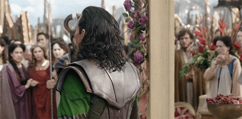


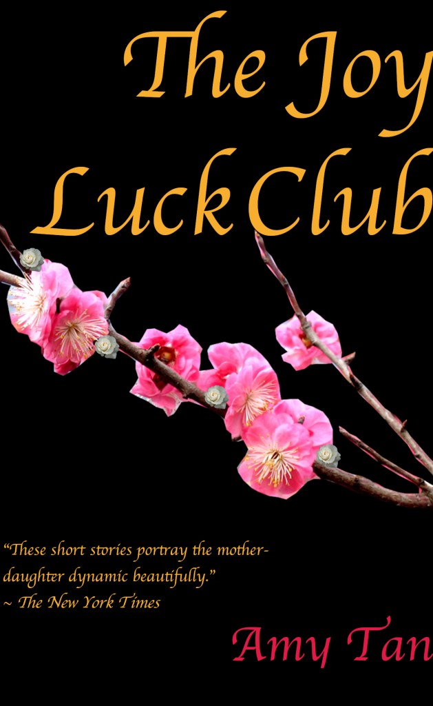
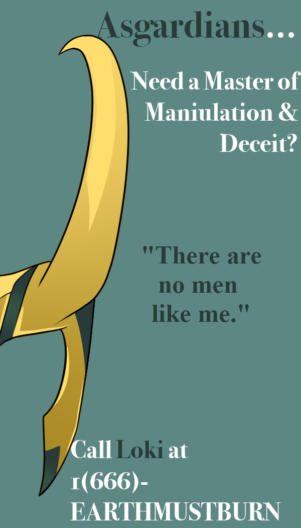 Here is the first color scheme I used on this card. With the help of Adobe Color Wheel and the “color picker tool” from Gimp, I was able to take the green color from the helmet, put it into the color wheel, and the website pulled up different colors that correlate with it. The first “Color Harmony Rule” (according to the website) I chose was monochromatic. This means that the colors are tints and shades from the one hue chosen, the green color from the helmet. The colors created were teal like, so I chose the lightest one on the right (out of the 5 given) to be the background. Then I chose the second darkest color (besides the hue) to use for my “accent” words. I wanted these words to “pop” which is why I chose a darker color. Both of the colors chosen are “cool” colors, meaning they recede into the background, but since the one that is darker is in high contrast with the white and the background, it still “pops!”
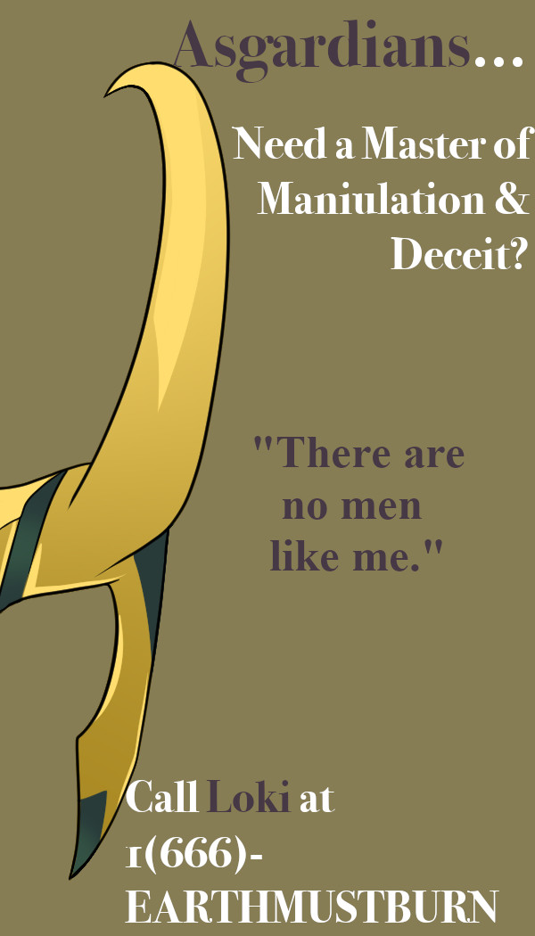 The second color scheme I chose is a part of a triad color scheme. Again, I chose the green from the helmet to be the hue that the other colors are based on. A “triad” is a set of 3 colors that are in equal distance from each other on the color wheel. In this case, much to my enjoyment, one of the colors is the nice tan color set as the background. This made me happy because tan is an interesting color to use as a background besides white and black. The maroon color chosen for the accent words also comes from the triad, just on the opposite side. This was a similar mindset as the card before, where there was a lighter background, so the darker words, even though maroon is a “cool” color, it still “pops!”
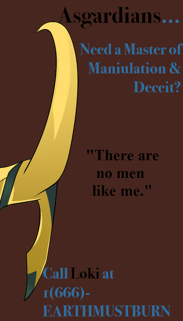 The third and last card, and personally my favorite, is a split complementary color scheme, or “compound” as it is said on Adobe Color. This means that the colors used are the ones right beside the complement (direct opposite) of the hue (again, the green from the helmet). This one is my favorite because it is not a color scheme I anticipated I would use. I chose the dark maroon background first because the other two cards have light backgrounds. Then I found that the blue worked really well for the accent words. Lastly, rather than keeping the other, non-accent words as white, I chose to make them black. This provided a great contrast that I didn’t know I needed.